Tuesday, July 29, 2008

When you hear the word "MASK", what comes to mind?

A costume?
Halloween?
Mardi Gras?
How about if we want to use this word in a crafting sense?

In a way it is the same idea as the others, we want to place a shape OVER an area that we want to "hide" or protect, so-to-speak, from our paint or ink. Webster's Dictionary gives one example: "a pattern of opaque material used to shield selected areas of a surface "

Linda here and I get to share my masking projects with you today.

It can be as simple as a Post It note placed over the area you want to shield but what I used on my projects is a decorative mask by Heidi Swapp. She has a number of really neat designs that are created for the purpose of being masks for a craftying project. I'm going to use this Damask shape because it is the perfect size for a card. These masks are made to "cling" to your project and then they can just be peeled off when you are done without the adhesive harming your paper and they are made of a vinyl kind of material that is non porous so the liquids you use don't go through to your paper.

There are several products that work great with these masks. I have gathered the products that I used. Spray Tsukineko's Walnut Ink, Clearsnap's Fluid Chalk stamp pads and a stamp.

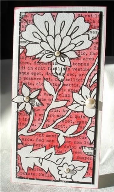
I decided that I wanted the Damask design to "appear" to be going off of the edge of my card so I cut my paper to the size of card that I wanted and determined where the fold would be but I didn't fold it yet. That way I could place the mask on a flat piece of cardstock and it was in the position where, when my card is folded it will be on the edge. I also decided that a fun and interesting look would be to have my finished design go around to the back of the card, so I incorporated the whole design.

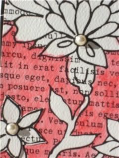
The mask is placed across the middle of the card and on the first card I used my Fluid Chalk stamp pads to "rub" a couple different shades of inks around the edges of the mask. I also stamped my "dictionary print" stamp over the mask while it was still in place and across the rest of the front of the card. So in this case, the mask served to keep the area under the mask to be free of the inks and stamping that I did. I took a fine line pen and did a quick and uneven outline inside the masked area after I removed the mask to help give my design more definition.
For this first card, I used a patterned paper by We R Memory Keepers. This particular paper is a 12" x 12" piece with four designs on the piece. You can see that the pattern changes on the back of the card. Just something that adds even more interest to the back of the card. For my second card, I used a solid piece of textured cardstock. This piece happens to have one edge that has a scallop cut to it. The only product I used to add color over the mask is the spray Walnut ink in the Java color which is basically black. All you have to do with this spray is give a couple quick spurts until you have the amount of color you want. DO PROTECT YOUR WORK AREA though! This stuff will go everywhere! Again, after I removed the mask, you can see that some of the spray ink seeped under the mask, so I took a fine line pen to help give a little more definition to my design and I also decided that an "imperfect" image was just fine because that is what I think "art" is about.
And added note for the chipboard word "love", I stamped over the word, rubbed the edges a little bit with a stamp pad and coated it with Aleene's Paper Glaze. OK, are you ready for the ADDED bonus???? When I sprayed the Walnut Ink on the mask for my last card, there was alot of ink that "sat" on top of the mask. I sure didn't think I should waste that, so I grabbed a piece of watercolor paper from a little spiral bound book that I have. I blotted all of that ink that was on top of my mask with this paper and I now I had an additional design and of course, had to create a card from it! ALWAYS card - Materials: Patterned paper – We R Memory Keepers
Heidi Swapp Damask mask
Epoxy word – Creative Impressions
Eucalyptus Walnut Ink spray
Fluid Chalk stamp pads – Clearsnap
Rhinestones in a circle – Heidi Swapp
Dictionary stamp – Stampers Anonymous
Scor-Pal for the embossed lines

BLUE/BLACK DAMASK card - Materials: Solid cardstock – Core’dinations
Heidi Swapp mask
Chipboard letters – Rusty Pickle
Java Spray Walnut Ink
Writing stamp – Crafty Secrets
Flower – Making Memories
Rhinestone – Darice
Pen – American Crafts
Clear Paper Glaze – Aleene’s®/Tulip

SECRET-CONFIDENTIAL card - Materials: Solid cardstock
Heidi Swapp mask
Chipboard letter – Thickers/American Crafts
Java Spray Walnut Ink
Various stamps – Art Declassified
Glitter Fabric Dimensional paint – Tulip
Sticker labels – Scenic Route
Rub-on words – Making Memories
Machine sewing

So glad you visited The Pursuit Of CraftYness today, Thanks, Linda

Saturday, July 26, 2008

Happy Birthday to Me!

Happy Birthday to Me Happy Birthday to Me Happy Birthday to Me! Insert...big large sigh! Why you ask? Well yes...today is my birthday but it's honestly not one I am thrilled about. You see next year is that HUGE birthday number. You know the one that looms in the distance but somehow it's no longer out there. It's right there! So this year's birthday has me a bit down.

So what's a girl to do when they're down? Well as Linda Beeson suggested I do..toast myself with a favorite drink and that can be none other than...a margarita!


To me..the perfect gift to give myself or a friend! Yummy, fruity Margarita's!!!


While browsing in one of my favorite stores, Home Trends, I came across this adorable Margarita set. The bright colors of the mix and the rimming sugars caught my eye. But the packaging was not cute at all! So my idea...dress up the mix and make a cute card to give as a gift. Because who would not like to receive this?

Supplies: Drink Mix, Creative Imaginations paper, Cricut Doodlecharms cartridge, Doodlebug Cardstock, Vellum, Bo Bunny ribbons and Colorbox Chalk Ink in Lime Pastel and Tangerine.


For the drink mix I cut a piece of white cardstock to cover the drink label. I added the fun print paper to the white cardstock after inking the edges. I adhered that to the bottles. I used the watermelon diecut image and cut out the limes on my Cricut. After tying the bow around the bottle I adhered the little lime wedge.


For the card I cut an A2 size paper from white cardstock. Added the print paper. I hand drew a glass onto the vellum. Then I cut a smaller size from the orange cardstock to adhere under the vellum to look like the drink portion. I printed out the greeting in Microsoft Word and cute out a tag. The little lime on the tag is cut out from the print paper.


Last but not least...one more diecut lime wedge for inside the card to finish it off! Showing a store bought gift can be easily personalized into a very fun and thoughtful gift! In fact so fun...this birthday girl just might keep it for herself! Care to join me for a drink?!

Happy Birthday to all the July 26 Leo's! May the sun shine brightly on you!

------------

Julia

Tuesday, July 22, 2008

Have you ever made your own pendant??

Hope everyone is having a great summer...
Kelly here to share with you something new...

Have you ever made your own pendant???
Not me... Until now.

So I am a dessert first kinda girl...

Here is the pendant I made using an epoxy kit...
I added a bit of beads and such and once it cured... This is the end result.

I created this and this was my first attempt, with that being said I have many more ideas brewing and cannot wait for a bit more time to play.


The first 3 pics are the supplies I used.... 

Easy Cast
Wax paper
Molds
Mold Release
Beads and such
Toothpick (not shown)
Jump rings
Chain


After you prep your mold...
Prepare the epoxy at a 50 / 50 ratio. Be exact or the results ( I have heard can be not so pretty )
Add your goodies...
3-d embellishments or even mix dyes for a marbled effect.

As the mixture was almost dry, I added the rings to the back side. This photo is the end result. To get out of the mold just twist and if you used the prep it should pop out.

I then added jump rings for the necklace to run through... depending on the type of necklace determines the size of ring... 

So for my post today I created a pendant... It could as easily been a pin for your jacket with changing the rings to a pendant back you would adhere this before it is completely dry.

Also Keep in mind it takes 72 hours for a hard cure.

Please, If you try this come back and share what you have created!!! 

Monday, July 21, 2008

Keep it real, Keep it simple, Keep it...

ah, well, you know where I'm going with this. Nothing fancy today... just keepin' it simple.

I suppose over time and over a million (or at least it seems like a million) projects, we each kind of hone our way down to what our favorite kind of style is. I've heard people ask others what they think their personal style is, or ask for help defining their own style. I don't really have a label for mine, either, nor do I think think that everything I do would even fit into a single category.

I do know that I am the most satisfied with a project when I can look at it and feel like it's finished. I know that I prefer my projects to have a clean look. I know that I generally prefer projects to be more on the quick and easy side than on the complicated side. Not that I don't like to try new things or do more complicated things as well... it's just a preference.

Sometimes we've honed our favorites down to specifics... after many years, I know that if I can make a no layer card look good, I consider that an accomplishment. I prefer smaller cards to larger cards. Lately I've been stuck on 3 1/2" x 5". (Smaller canvas = less space to fill = simpler project = a happy me.)

So, here's a few quickies along the lines of what I prefer. Not that I'm super satisfied with them... I think these are both first drafts of what could be better projects. But, nearly all of my projects have first drafts, and that's ok with me.

First up is this no-layer quickie with my favorite ribbon...


Materials
Stamps: Spiral Bouquet (Papertrey Ink)
CS: Kraft (PTI)
Ink: Craft White (SU), Charcoal Chalk Ink (Colorbox)
Ribbon: Michaels


I already had the Kraft cardstock out, so I continued on with this one. I tried to make the branches a bit more tree-ish by repeating it a few times. I like the lone branch look, but I wanted to switch it up a little. I love this quote because I can use it for a lot of different occasions. It's kind of a "just because" card without saying "just because."


Materials:
Stamps: Out on a Limb (Papertrey Ink)
CS: Kraft, White (PTI)
Ink: Chestnut Roan Chalk Ink (Colorbox), Bamboo Shoot (Versafine)
Ribbon: PTI


So that closes out a week of more blogging that I have ever done in my life! I'll be passing the torch on Wednesday to one of the other super talented POC gals, so check back in then!

I'm out!
Jessica

Friday, July 18, 2008

Goodbye, bling...

And so we have saved the best for last in our trip down Memory Lane in Blingville...


There are just no words that can adequately sum that one up, are there? It's our own Melanie (a.k.a. Catwoman) with someone who resembles the Tin Man. More like the Tin Man from the 80's. Or something. He is quite silvery. And shiny. And blingy. Love it!

(And for the record, that's not Melanie's husband, either!)

It's only right that we bring you Melanie's bling project next...


Title: I've Got You, Babe
Designer: Melanie Douthit

Rhinestones: Prima Marketing
*Bling*: Stickles: Ranger
Cardstock: Bazzill Basics
Patterned Paper: Websters Pages
Trim: Melissa Frances
Chipboard: Basic Grey
Flowers: Prima and Craft Store
Buttons: Basic Grey
Ink: Clearsnap
Stickers: Making Memories
Other: Tulle


On to some bling-filled cards!

Jennifer's monochromatic card features glitter embossing powder and Stickles glitter glue. I love how the Stickles give the flower some added dimension.


Designer: Jennifer Ellefson

Paper, stamps, ink, ribbon - Papertrey Ink
Stickles (Ranger)
Stardust Gelly Roll pen (Sakura)
Gilded Ivory embossing powder (Sparkle n' Sprinkle)
Slot punch (Stampin' Up!)


This card by Stacey just makes me laugh! The rhinestone crown fits perfectly on the scalloped tag and notice the unusual item in the supply list... insulating tape!


Designer: Stacey Stamitoles

Rubber Stamp: Hampton Art Stamps
Paper: Reminisce
Cardstock: Bazzill
Silver insulating tape (hardware store)
Crown bling- Me and My Big Ideas
Scallop Glitter Die Cut: Making Memories
Brads: Making Memories
Chipboard: Maya Road
Paint: Plaid (Folkart)
Ink: Versafine (jet black)
Colorbox (silver)
(stamp reads: "I do not refer to myself as a 'housewife' for the reason that I did not marry a house")


And our last bling week project is brought to you by Melissa. I love how all the patterns work together and especially the icy blue glitter accents.


You Make My Heart Melt
Designer: Melissa Phillips

Me and My Big Ideas bling hearts
Bazzill cardstock
Foof-a-la paper
Kaisercraft paper
Webster’s Pages paper
Daisy D’s paper
Cornish Heritage Farms stamps
Stickles glitter
Stazon ink
Offray ribbon
Darice string
Button from craft supply


All righty, kids. Let me lift my glass (of V8 Fusion... good stuff) in a toast to bling.

May we never forget the sparkle it brings to our projects.
May our use of it be inspired and abundant.
May we never spill an entire bottle of Dazzling Diamonds all of our work table.
But if we do (voice of experience), may each twinkle remind us of the power of bling.

Cheers!
Jessica

Wednesday, July 16, 2008

More bling & a bonus tutorial!

Jessica brought us the first blog entry, Monday, which kicked off bling week. Again, with her charm and wit; with her beautiful blue sequin gown, hunky date and blue dyed shoes to match that smokin' hot dress. Well, you have MET YOUR MATCH, Miss Jessica! bwahaha!
I was stylin' my smokin' hot dress back in 1988! The middle of the glam rock era... Aqua Net hair spray and just all around fashionable times! (ha!) Notice the tamed down hoola hoop Bob haircut, white pantyhose and MY blue DYED shoes! Unfortunately, you can't see the blue shimmery substance around the waist, and the blinged out decorative flowers on the bust of my dress. If I'm not mistaken, our dresses may have been within the same blue color family. So I ask our readers to join in and say it with me... 'Jess, you blue sequined goddess, embrace your inner bling'.
(Oh, and my husband would also like to go on record that the young man in the photo is not him.)

Enough of the nightmare flashbacks from the late 80's...we have some current bling that you will love! Today's projects are from Miki, Sherry and Linda. Miki 'blings up' the end of this blog entry with a glam-rockin' tutorial on making your own Bangle Bracelets!


To note: The black/white background is created by painting black paper with white paint and then stamping the vine stamp over that.

Thank You card
By
Linda Beeson
Materials:
Cardstock – WORLDWIN Papers/Deep Black and Crafty Brown/Treasures, WORLDWIN Papers/Berry Red/DoubleMates
Rhinestone swirls and little flower – Prima
Paint – Apple Barrel/PlaidBackground
Stamp – Cornish Heritage Farms
Black stamp pad - Stazon


First Steps Layout
By Sherry Wright
Materials:
Cardstock: Prism cardstock
Felt & Accents: Queen & Company felt, brads, and jewels
Stickers: American Crafts thickers
Adhesive: Zip dry adhesive by Beacon


Wooden Bangle Bracelets tutorial and images
By Miki Benedict


Make some bling just for yourself (or a friend!) using unfinished wooden bangles. After experimenting a bit, I found that quite a few of my scrapbook supplies could be used on them. In fact, I had so many ideas with the supplies that I already had on-hand, I wish I had purchased more bangles from http://www.diybangles.com/!

The first one I kept simple by only inking and adding flowers.

I simply inked with the Distress Walnut Stain using my blending foam. I kept adding layers until I liked the color of the bangle. Then I sprayed it with a few layers of acrylic gloss sealer, following the directions on the can. I let it dry for quite a few hours (it was hot here, so I wanted to make sure it dried thoroughly) before adhering the flowers & their centers.

Supplies:Wooden Bangles: www.diybangles.com Ink: Ranger Distress Walnut Stain Flowers: Prima Calypso Accent: Carolee’s Creations Jewel Droplets Adhesive: Beacon Adhesives Zip Dry Sealer: Plaid Clear Acrylic Gloss Tools: Ranger Inkssentials Ink Blending Foam

This one I was a bit more daring and used rub-ons for a decoration.

I found that smaller sized rub ons were easier to handle and that using a bit of scotch tape helped to hold it in place while I rubbed. Make sure they are all rubbed on really, really good! Once I had all the rub ons that I wanted, I went over the bangle with the Distress Shabby Shutters using my blending foam again. Then I sprayed on the same sealer as I used above. I have no idea how long the rub ons will last, but the sealer seemed to do a good job.

Supplies: Wooden Bangles: www.diybangles.com Ink: Ranger Distress Shabby Shutters Rub-Ons: Basic Grey Fall Leaves Sealer: Plaid Clear Acrylic Gloss Tools: Ranger Inkssentials Ink Blending Foam

The last one I did I used some stamps.

First, I painted it with Twinkling H2O Ocean Wave. I kept misting my jar until it was the right consistency and then I painted it on with a paintbrush. It took quite a few mists of water to get the whole bangle completed, but it was worth it. The color is really pretty in real life! Once it was dry, I stamped on some swirls using StazOn ink. The easiest way to do this is to ink the stamp, set it on your table (inked stamp up) and then roll your bangle over it. That way the stamp follows the curve of your bracelet easier. After the ink dried, I lightly sanded in a few random spots giving the stamps and paint a bit of distressing. Then I used a makeup sponge and lightly inked the bangle with some StazOn. Finally, I finished off with the sealer again.

Supplies Used: Wooden Bangles: www.diybangles.com Ink: Tsukineko StazOn Black Watercolor paint: LuminArte Twinkling H2O Ocean Wave Stamps: Scrappy Cat Designer Flourishes Sealer: Plaid Clear Acrylic Gloss Tools: water spritzer, paintbrush, makeup sponge, sand paper

And Jess will be back on Friday with even more bling! Remember to embrace your inner bling!
-Stace

Monday, July 14, 2008

That Bling You We Do!

Rejected titles for this post may include but are not limited to...
Blah-to-Bling! (say if fast and it sounds like "bada bing!")
Bling it On! (too obvious)
The Big Bang Bling! (makes no sense... catchy, though.)

So, for your viewing pleasure, the POC team will be bringing you all things bling this week. Stacey and I will be your hosts for our blingy good time, and we hope you enjoy.

Before we get started with all the blingyness... let me just say that me and bling... bling and I... we've had a love/hate relationship over the years. I find it somewhat ironic that I am hosting our little blingfest and yet it pains me to put more than one layer on a card, much less bling!

Don't get me wrong... I'm not hatin' on the bling. Far from it. I acknowledge and embrace the fact that super-fine glitter and self-adhesive rhinestones are possibly the greatest inventions since sliced bread and Velcro rollers. It's just that I've been scarred by bling.

I now enter, for the record, Exhibit A...


Photobucket


Don't judge me. I know it was wrong. I have asked for forgiveness from the gods of fashion. All I can say is... it was 1994. I was a freshman in high school and apparently did not know any better. And, if you must know, yes, the shoes were dyed to match. It is literally *painful* to look at, isn't it?

It is this picture that cautions me in my use of bling. Bling in the hands of others... brilliant. It is clear that I cannot be trusted with it. And so, my friends, my use of bling may be sparing and deliberate, but know that it is used with love from a chick who once nearly drowned in blue sequins.

I will leave it up to my fellow POC'ers to bring you the truly blingful, the blingiest of the bling, the bling that leaves all other blings jealous. I'm sure you will find their use of bling to be fabulous and inspiring. There is not a blue sequined mistake in the bunch!


Photobucket

Photobucket

Beautiful layout
By: Julia Sandvoss

Ki Memories Hopeful papers, chipboard flowers
Doodlebug "Beautiful" sticker
Autumn Leaves Chipboard Journaling Accent
K & Company Butterflies
Pink Stickles
Pink Cotton rick rack
Doodlebug Jewels
Assorted Rhinestones
Martha Stewart "Cornice Edge" Border Punch and Journaling Pen
Colorbox Chalk Inks


Photobucket

copy 2

White/Pearl Flowers Card
by Linda Beeson

Solid cardstock Patterned paper – Paintables/Prima and Collage
Watercolor Crayons
Watercolor Brush
Self Adhesive pearls – Mark Richards, Inc
*Technique note - Linda painted the background only of the Prima Paintables and left the flowers white as they are on the original paper


Photobucket

copy 525

Favorite Finds Box
by Stacey Stamitoles

Stickers: Magenta Style (Paisley silver) and March Richards Peel offs (silver corners)
Box: Hobby Lobby photo box
Pens: Sakura Gelly Roll (to color in the stickers)
Paper: Making Memories
Crown: MMBI
Pink Gems: EK Success
Beaded Trim: Style-a-bility


Photobucket

Get Well Soon card
by Jessica Witty

Stamps: Polka Dot Basics & Faux Ribbon (Papertrey Ink)
Hybrid Ink: Summer Sunrise & Berry Sorbet (Papertrey Ink)
Cardstock: Kraft & White (Papertrey Ink)
Ribbon (Papertrey Ink)
Dazzling Diamonds glitter (Stampin' Up)
Glue Pen (Sakura)

As a final note, my husband would like me to enter, for the record as well, that no, he was not my date to the prom. And while I'm noting things for the record, let me go ahead and state that yes, I have much better taste in clothing now. Recently, I even purchased an article of clothing that has sequins on it. I have worn it once and did not feel like a complete fool. Progress, my friends... progress.

Stacey will be bringing on the bling this Wednesday. I'll catch you again Friday!
Later!

Jessica


Saturday, July 12, 2008

Heat Embossing 101

We've all been there - the day that you decide you want to take your beginner stamping skills to the next level. You know exactly what you want to do, you love it, you know you can do it. You just don't know exactly where to start.

Yes, I'm talking heat embossing. That timeless technique that never fails to WOW a non-stamper. (Yeah, notice I said non-stamper...because I'm going to let you in on a little secret. The rest of us know just how easy it is, and after this post, you will too! Shhh, don't tell the non-stampers - we still need that re-affirming WOW every so often!)


So, obviously you're going to need a few things. Stamps, ink, heat gun, embossing powder - they're the must haves. I also like to have a silicone sheet, a funnel tray, an embossing 'buddy' and a paintbrush.

What's important? Let's start with your ink. You can't just use any ink, so you need to either use a pigment ink or a different ink that will stay 'wet' long enough to grab the embossing powder. My fave? Versamark, but I also like embossing with Versafine (which isn't supposed to be able to be done, really, but you can if you work relatively quickly).

Every so often I see questions on message boards asking about the best brand of heat guns. I never have much to contribute to those conversations because I am still on the first one I bought - a Marvy Uchida one from my local craft chain store (which means you can use a coupon!). I've had this one for nearly seven years now, and it is still going strong. (And if I just jinxed myself, I would replace it with this exact model!) One thing I will tell you - you can't skimp by with a hair dryer, so save yourself the frustration.


Here's what I like to do first, rub my Embossing Buddy across my paper. I actually bought this (again, craft chain, in the rubber stamping section, for a couple of dollars). As you can see, it's really plain and easy to overlook, but I find it to be an important step. It cuts down on the static on your paper, which leads to less stray pieces (more on this in a minute). I've seen where people actually make their own little sacks from fabric and corn starch; I haven't tried this personally, but if any of our crafty friends have, I would love to know how it works!


Next, you just want to stamp your image as you normally would, just remember to think about the kind of ink you want to use. Here, I chose Versafine Onxy Black so you would be able to see the contrast a bit better. Make sure you get a good image and then with relative speed (don't go answer the phone!), you're ready to move on to the embossing powder.


I like to lay my image in a funnel tray. This catches all the spare powder (which you can put back in your container to use again). Just sprinkle it on your image, covering it well. Use the paper as a sort of sifter, shaking it slightly back and forth to cover your image completely.


Now it is time to tap off your excess. Again, you can do this over a funnel tray (or a piece of paper) to save it for next time.


I choose clear embossing powder(EP) for this project, but if you're using a colored EP, this is the time that you should really examine your piece for "stray" pieces of embossing powder. See, this is what separates the men from the boys, so to speak. I use a paint brush to wipe them off of my project (because after you try this once with your finger, you'll be muttering all sorts of fun words under your breath!). It's important to remember that when you're embossing, static is NOT your friend, and if you attempt this with your finger, you will create more static problems than you will solve. A paint brush is a good way to avoid that.

Why are the strays so important? Well, those little strays aren't going to blow away when you turn on your heat gun, they're going to melt into exasperating little blemishes that will turn those mutterings into full-fledged outbursts. Trust me. ;)


Once you're stray-free, you're ready for the show! Protect your work surface with something that can take some heat, plug in your gun, and if your piece is small enough to take flight from the air from the heat gun, grab something with a non-metal handle to hold it down in a corner (I usually grab my dry-embossing stylus). Remember, it has to be able to take heat, but if it's metal, you're going to get burned when it heats up.

While you have your gun on, it's important to remember a few things. One, paper is flammable. (No first hand knowledge of this one, thankfully!) Keep your gun moving over the powder, don't be tempted to linger too long in any one area, because even if it doesn't catch on fire (lol), you will be very likely to see a scortch mark. Two, it takes a little longer than everyone thinks the first time. What's going to happen is this - you will see it melt. It's like magic and the first time is pretty darn cool (and the second time, and the thousandth). When it happens, you know. And when it happens all over your project, you're done.


Those are just the very basic steps, so if you haven't tried this before, I think you are now ready!

When you're ready to venture out, you can start exploring different colors of ink and embossing powders. There are many options! If you use Versamark, you have the perfect color ink for any color EP. However, if you're using different colors of pigment ink, keep in mind the color EP you choose. You can use it to accentuate a color (try white pigment ink with white embossing powder for a great, solid white look that's hard to beat!) or to make contrasts. And clear embossing powder is a great thing to have on hand to go with all your inks.

Distess embossing powder is a great product if you're looking to venture even further into the world of embossing. It is manufactured by Ranger and designed to go with their Distress inks. It is an interesting concept because it is made for an inconsistent application - you go about the embossing process just as I outlined, only at the end of heating, you rub off some particles that are designed NOT to melt. It gives a great worn feel - hence, Distress, I guess! ;)

Hopefully this gives you the confidence to go ahead and give this great technique a try. There are other great tips that you may be interested in as you advance, so if you find that is the case, let us know and we'll be happy to discuss them here!

Be well ~ Jenn